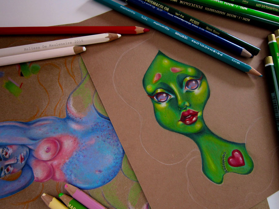
Trying out some shading techniques. The lady on the left was, for the most part, shaded with white Prismacolor pencil. The one on the right with lighter tones of green and some yellow. The difference is that white washes out the colors and using a lighter tone of whatever color you’re working with, keeps the vibrancy. Using dark green and blue for shading gave a better look than if I had used black. Black quickly makes shades look “dirty”.